Home Dashboard Redesign
RocatPro
Timeline
Augtust 2025
Deliverable
UI Design
My Role
UI/UX Designer

Overview
RocatPro is a Warehouse Management System (WMS) used to monitor inventory, assets, storage capacity, and transactions.
This project focused on redesigning the Home page to improve data clarity, prioritization, and usability for daily operational monitoring.
The redesign transformed a static, fragmented dashboard into a clear, actionable overview—helping users quickly understand system status at a glance.
Why the Home Page Needed Improvement
The Home page is the first touchpoint for users starting their daily workflow.
However, the previous version struggled to support quick comprehension and decision-making.
Key Pain Points
Information hierarchy was unclear
Critical metrics were hard to scan quickly
Visual density made charts difficult to compare
Recent activities were not easily noticeable
Dashboard felt more like a report than a control center
The Goals
Improve information hierarchy and scanability
Make key warehouse metrics instantly visible
Highlight recent transactions as actionable items
Create a clean, modern, enterprise-ready dashboard
Support scalability for growing data volume
Design Approach
1 — Re-thinking Information Hierarchy
The new layout prioritizes:
Primary KPIs at the top
Supporting data grouped into clear cards
Charts placed after summary metrics for context, not overload
This allows users to understand system health in seconds.
2 — KPI-Driven Dashboard
Instead of spreading numbers across multiple sections, the redesigned Home:
Emphasizes total objects, assets, and archive types
Uses visual grouping to reduce cognitive load
Separates summary from detail
3 — Clear Data Grouping & Cards
Each card now represents a single concept:
Object overview
Data size
Warehouse capacity
Client location distribution
This modular approach improves readability and scalability.
4 — Improved Data Visualization
Charts were refined to:
Use consistent color logic
Reduce visual noise
Improve legend clarity
Focus on comparison rather than decoration
The goal was not “more charts,” but more meaningful charts.
5 — Actionable Recent Transactions
Recent transactions are now:
Clearly visible on the right side
Easy to scan
Directly actionable (e.g. order verification)
This turns the Home page into a working dashboard, not just a summary.
Before vs After
Before
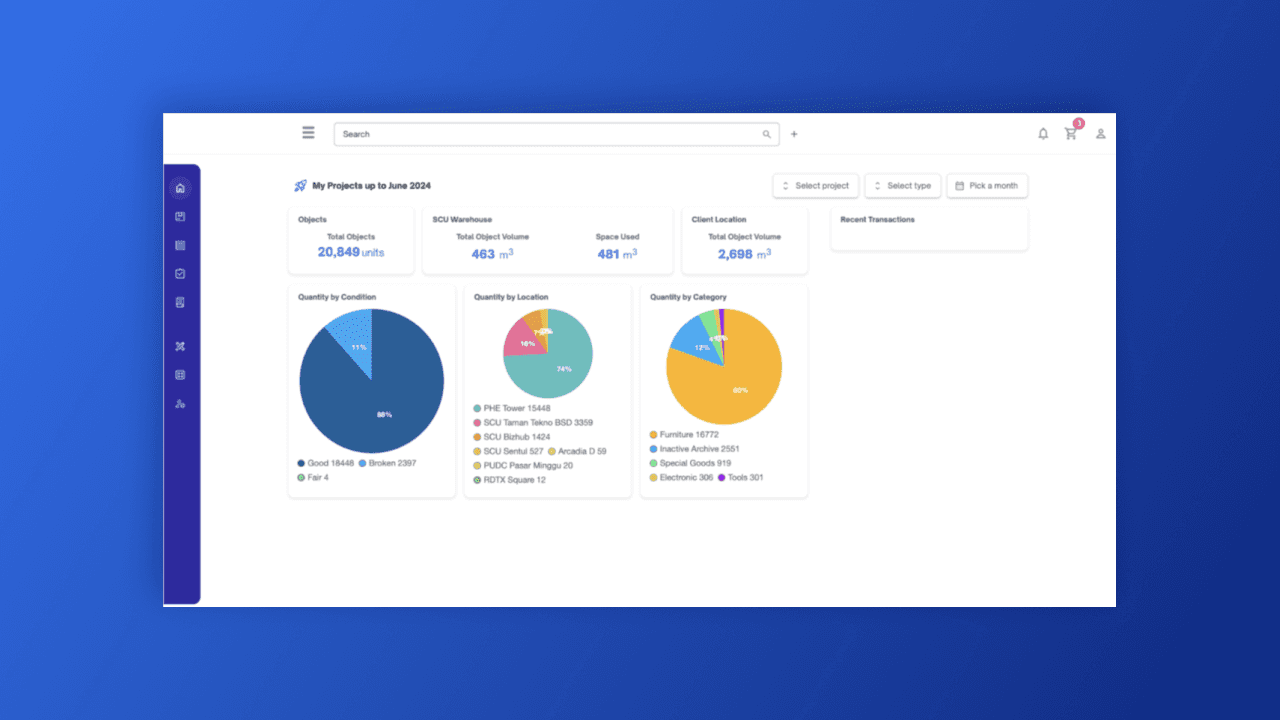
Dense layout
Low visual hierarchy
Difficult to scan key information
After
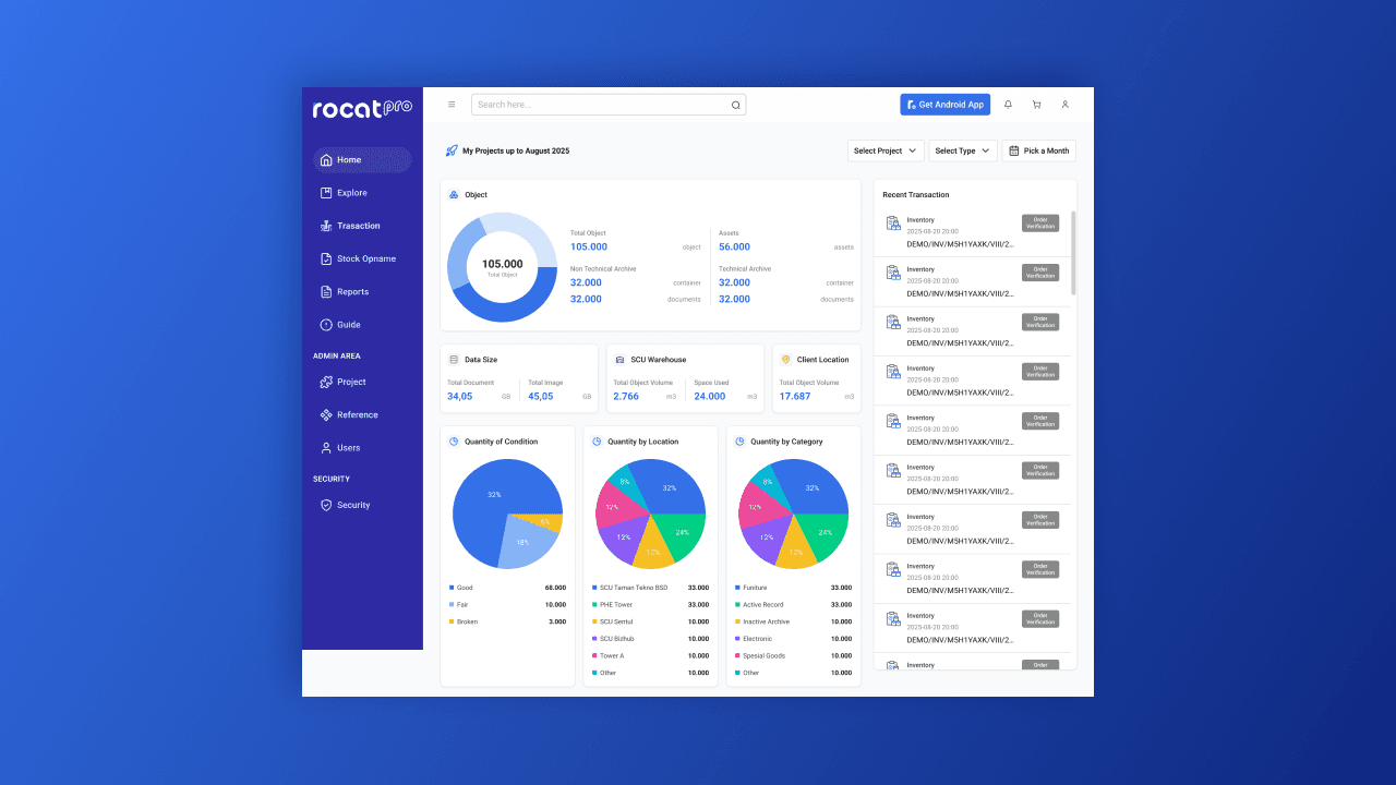
Clear KPI prioritization
Structured card system
Better chart readability
Strong focus on daily operational actions
Impact
Faster understanding of warehouse status
Improved daily monitoring efficiency
Reduced cognitive load for users
More professional and modern enterprise UI
The redesigned Home page now functions as a true operational command center for RocatPro users.
Key Learnings
Dashboards should prioritize clarity over completeness
Strong hierarchy is essential for data-heavy systems
A good Home page supports decisions, not just displays data